Design, Colors, and Fonts

One Team. One Little League.

The Design Process

More than two years ago, Little League® International started the process of evolving the organization’s mission, logo, and look, with the goal of providing an updated, modern, inclusive new brand. At the core of this project, one thing became very clear – A brand is more than just a logo, and a logo is more than just a mark or symbol. It must seamlessly adapt with other design elements across colors, dimensions, and uses.

1949 - 2020 Logo

Throughout this new brand design process, Little League connected with its staff and volunteers, explored the organization’s history and impact throughout the world, and looked to the future to bring this new brand identity to life.

line spacer

Colors

The new, primary Little League logo is made simply of two colors, red, and blue. Together, these two hues represent our organization on many levels.

BLUE

Blue represents the strength and experience we take from our rich heritage.

RED

Red represents the passion and friendly warmth that Little League is known for, from the players to the leadership.

TAN

Tan provides a vintage feel amidst a modern brand to connect the history of the program.

Along with the primary logo, each of the three divisions of Little League hold their own, distinctive colors that tell a story about that program.

BASEBALL

The blue color displayed in the Little League Baseball® logo was created based on the traditional blue that can be found in the iconic Little League Baseball patch that has been a piece of the organization’s rich history for decades. In addition, this rich blue color has been customarily seen in a variety of Little League Baseball signage throughout the years and represents the iconic tradition of the program.

SOFTBALL

The new orange color in the rebranded Little League Softball® logo was chosen based on the history that was made in the first Little League Softball World Series in 1974, representing the orange jerseys worn by the first champion, Wellswood Little League of Tampa, Florida. Since that year, the Little League Softball program has opened the door to create opportunities to hundreds of thousands of young girls and all started with the historic tournament that took place that summer in Freeport, New York.

CHALLENGER

Representing the green of the fields where children with physical and intellectual challenges get the opportunity to play the game of baseball and softball, the new Little League Challenger Division® logo portrays the Field of Opportunity that the program provides to thousands of children around the world each year. In addition, the logo displays the green light to every child to ensure they know they are welcome to be a part of the Little League program, no matter what their circumstance may be.

line spacer

Fonts

Our brand uses five typefaces: Grand Slam, Home Run, Futura, Quotes Script, and Miller Text. These typefaces work together to bring our messages to life.

Grand Slam Font

Grand Slam is the primary display typeface for our brand. It’s an all-caps typeface that we use mostly for headlines. We use it primarily at large scales, although it can be used for subheads at smaller scales. There is also an oblique weight available to create more dynamic typographic compositions.

Grand Slam Rounded GRAND SLAM TYPEFACE
The rounded, unfinished edges of this serif typeface reflect the down and dirty nature of our sports.
Home Run Font

Home Run is closely related to Grand Slam and supports our type system as a secondary display typeface. Both fonts have similar serifs and texture, but Grand Slam is narrower overall than Home Run. Mix and match these two typefaces to create more dynamic headlines, using Home Run for longer headlines.

Grand Slam Home Run Typefaces TYPEFACE COMPARISONS
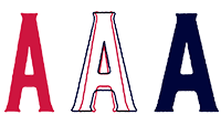
Grand Slam typeface in red and Home Run typeface in blue.
Futura

Whereas our display typefaces are reserved for headlines and subheads, Futura can be used for anything. Such uses include headlines, subheads, body copy, and captions. Futura is a very versatile typeface with many weights. A modern sans-serif, it has curves that feel youthful and approachable, yet serious.

Quotes Script

Quotes Script is an accent font that adds a feeling of youth and playfulness to our visual language. While it shouldn’t appear in every piece, we use it to add extra emphasis to certain words or phrases, in combination with our other typefaces. We often set text in Quotes Script on a baseline that’s tilted upward at 10–20 degrees.

Miller Text

For certain communications where a serif typeface is needed, Little League uses Miller Text.